critiques welcome *LINK*
ebd
>My first attempt at a web presence. Don't worry about being brutal. Be honest.
Eskimo Blue Day Woodworks
Knowledge You Can Build On — Est. 1998

critiques welcome *LINK*
ebd
>My first attempt at a web presence. Don't worry about being brutal. Be honest.
Eskimo Blue Day Woodworks
Re: critiques welcome
dan oliphant
>Great looking work, and a lot of attention to details.
Re: critiques welcome *LINK*
Brian Hahn in SW Wisconsin
>First, I like that it is dial-up friendly and the thumbnails loaded quickly.
I would suggest increasing the compression on the larger images. You can get the same apparent level of detail from a file 1/4 the size. (On my software, a setting of 100 is no compression, and a setting around 85 gives a virtually identical image on the screen and a much smaller file size.)
Jamie Donaldson can give you some photographic advice. Or check out his article here on WoodCentral. John Lucas has also given a lot of photographic advice if you search the archives.
The Phrugal Photo Studio Way to Shoot Woodturnings
Re: critiques welcome
Texian
>Looks like an excellent start. First thing that strikes me is that the photo backgrounds are varied and distracting. So would suggest that you use a seamless white background, or better yet a graduated background, shading from white to light gray.
Re: critiques welcome
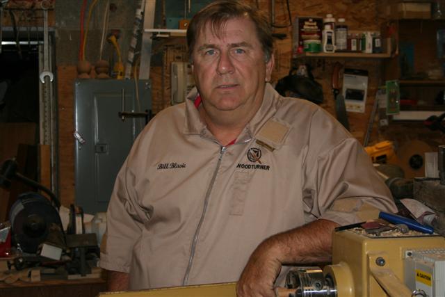
Bill Blasic
>ebd,
Is there a specific reason you chose the 1280 X 1024. Most sites that I know of use 1024 X 768 and require no scrolling. Besides that on my monitors that setting cuts the size of type in half making it harder to read. Just wondering.
Bill
Re: critiques welcome
ebd
>I guess only because that's the resolution that I use. I'll see about converting to the lower resolution. It might be a lot of work if I have to re-create all the HTML & JPG files.
Internet Explorer
Ken Grunke from SW WI
>when a site specifies Explorer for viewing, I'm outa here. I don't use IE but in your case, there's no reason to recommend it as it works just fine in Firefox and probably any of the common browsers.
On my 15" screen set at 1024 x 768, the fonts look about twice as big as normally seen on other sites, not sure why, when Bill says the text is too small.
An easy way to downsize the images if you decide to do that: leave the images be, just change the values in the HTML source to a percentage, such as 75% or 80%.
Minor technical detail--font color tags aren't closed in your index page.
I usually leave the photo critiques to Jamie D and John Lucas but can't resist saying you should ditch the terrycloth backdrop! Looks like a used bathroom towel! That's as brutally honest as I'm getting. A clean, new seamless backdrop will do wonders for your work, which overall looks very good.
Re: critiques welcome
GalenV
>I'm new to wood turning and have tried to save links to personal wood web pages. I like to learn who the turners are and where they are located. The first thing I did was click on your Home link thinking it did not open to your home page. How about adding your Eskimo Blues Day Woodturning to your home page and at least in your bio put who you are and what part of the country you are from. Maybe it is just me but I like to see the person by a photo, even if some turners use 20 year old pictures. I�d be the first to not post my picture!
I enjoyed the easy to see pictures of your work. I did have to scroll to see your text. Not being into photography myself they are better than my home shots of my turning. Don�t think background can improve what I do.
Your turnings have some different form than I see by other turners. Sometimes to me it is the simplest form that shows a wood. Your black walnut and zebra wood platter really caught my eye. Maybe because I have only tried one platter and it was boring.
Must be a challenge to develop your own web site for it reflects who you are.
I saved your link and it will be interesting to see what develops on it and in your work.
Galen
Re: critiques welcome
david
>No means an expert on webcontent creation, but you asked for comments:
1) Ditto the other comments on background. 2) I believe that text content should not be longer than a viewable page and not require scrolling. 3) Think that your home page should have a large visual content as an initial introduction to viewers. Good start...Like the fast loading of the images.
Re: critiques welcome
keith zimmerman, Normal IL
>The first thing that strikes me when I open the link is the lack of identity. There is nothing to identify this website. I think you should at least add the name of the site to the top of the page. For all I can tell, the site name might be "woodandme.com". You want to avoid confusion for viewers as it will drive them away.
Also, I agree that 1024x768 would be a better screen size.
keithz


