In the early days of web design, when the internet was still in its infancy and CSS (Cascading Style Sheets) was not widely supported, designers faced a significant challenge: how to structure and style web pages effectively. At that time, tables emerged as a popular solution, not because they were designed for layout purposes, but because they provided a convenient way to arrange content on a webpage.
Tables, originally intended for displaying tabular data, offered a grid-like structure that allowed designers to position elements precisely. With the limited styling options available, using tables for layout seemed like a logical choice. However, as the web evolved, and the need for more sophisticated designs and responsive layouts arose, the shortcomings of this approach became apparent.
One of the main reasons designers wrongly used tables for layout was the lack of better alternatives. CSS, which separates the structure of a webpage from its presentation, was not fully supported by all web browsers in the early days of the internet. This forced designers to rely on HTML tables to achieve desired layouts, even though it went against the intended use of tables.
Additionally, the concept of web standards and best practices was still in its infancy. Many designers were self-taught or learned through trial and error, leading to a proliferation of practices that were less than ideal. As a result, using tables for layout became a common practice, despite its inherent limitations.
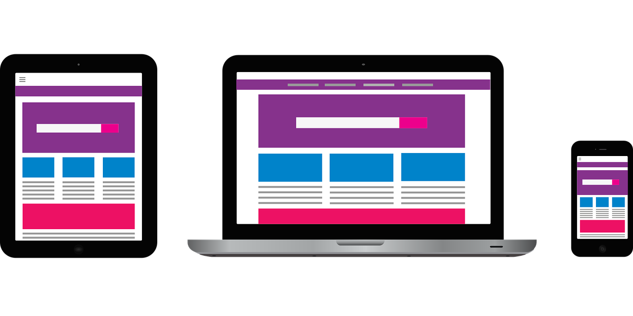
Fast forward to the era of mobile devices and responsive web design, and the repercussions of using tables for layout became even more pronounced. Converting websites built with table-based layouts to responsive designs poses numerous challenges:
- Semantic structure: Tables lack semantic meaning when used for layout, making it difficult for screen readers and other assistive technologies to interpret the content correctly. This can result in poor accessibility for users with disabilities.
- Nested tables: Many table-based layouts rely on nested tables for complex designs. Untangling these nested structures and converting them to modern, CSS-based layouts can be a daunting task, often requiring a complete overhaul of the codebase.
- Inflexible grids: Tables offer a rigid grid structure, which doesn’t adapt well to different screen sizes and orientations. Creating responsive designs requires fluid grids that can adjust dynamically based on the viewport size, something that tables were not designed to handle.
- CSS complexity: Converting table-based layouts to CSS-based layouts involves rewriting stylesheets from scratch. This process can be time-consuming and error-prone, especially for large and complex websites.
- Browser compatibility: Older table-based layouts may contain outdated HTML and CSS code that is not compatible with modern web browsers. Ensuring cross-browser compatibility while updating the layout adds another layer of complexity to the conversion process.
Despite these challenges, converting table-based layouts to responsive designs is not impossible. It requires careful planning, attention to detail, and a thorough understanding of modern web design principles. By embracing CSS-based layouts and responsive design techniques, designers can create websites that not only look great on all devices but also adhere to web standards and best practices.
In conclusion, while tables served as a convenient layout tool in the early days of web design, their misuse has left a legacy of challenges for modern designers. Converting table-based layouts to responsive designs requires overcoming a host of technical hurdles, but the end result is a more accessible, flexible, and future-proof website that meets the demands of today’s diverse digital landscape.