The preference for a light or dark computer theme is influenced by several factors, including display technology, ambient lighting, visual comfort, the type of work being performed, and individual eyesight. Neither theme is universally superior; each has advantages under different conditions.
1. Ambient room lighting
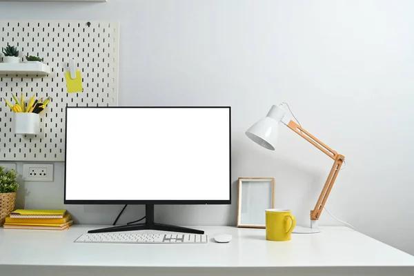
Light theme — bright environments
A light background often works well in a sunlit office, near windows, or in a room with bright overhead lighting. Its brightness is closer to that of the surrounding environment, which can make the screen feel more natural and reduce the contrast between the display and the room.
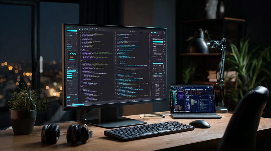
Dark theme — dim environments
A dark background can be more comfortable in a dimly lit room or when using a computer at night. It reduces the overall light emitted by many displays at typical settings, making a bright screen less conspicuous against dark surroundings.
The important consideration is the relationship between screen brightness and ambient light. A white screen at full brightness in a dark room can be uncomfortable, but so can a dim screen in a brightly lit room. Adjusting brightness may matter as much as choosing a theme.
2. Display technology
The type of screen can influence the practical benefits of dark mode.
| Display type | Light theme | Dark theme |
|---|---|---|
| OLED | More pixels emit light to display white backgrounds. | Black pixels can turn off entirely, reducing power consumption, particularly with large dark areas. |
| LCD (IPS, TN, VA) | Often a good choice for documents and general office work. | Can reduce the light emitted by the screen through darker pixel values, but the backlight generally remains on. |
| Mini-LED LCD | Bright, clear content, particularly in well-lit rooms. | Local dimming can reduce backlight illumination in dark regions, although blooming may occur around bright objects. |
| E-ink | Often resembles printed paper and works well for reading. | Depends on the device; many e-ink screens are optimized for a light background. |
Important distinction: Dark mode saves more display power on OLED screens than on conventional LCD screens. On an LCD, dark pixels do not normally switch off the backlight, so energy savings are generally smaller and may be negligible depending on the display.
3. Eyesight and visual comfort
Individual vision is one of the most important factors.
- Astigmatism and other optical issues: Some people find white text on a dark background appears to blur, glow, or develop halos. This can be related to optical aberrations and the way the eye responds to bright text against a dark field.
- Light sensitivity: People who experience discomfort from bright screens may find dark themes more comfortable, especially in low-light environments.
- Reading fine text: Dark text on a light background often provides a more familiar and consistently legible reading experience, particularly for small fonts and lengthy documents.
- Aging eyes: Changes in contrast sensitivity, pupil response, and the eye’s optical clarity can influence which theme is more comfortable. Many older users benefit from a light background, sufficiently large text, and strong contrast, although individual preferences vary.
Dark mode does not automatically reduce eye strain. For many people, the most important factors are appropriate brightness, readable text, font size, contrast, and regular breaks.
4. The type of work being performed
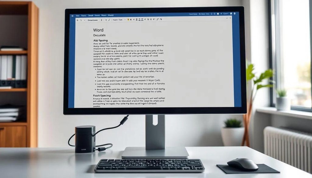
Documents, articles, and web browsing
Light themes often work well for reading long passages, editing text, reviewing spreadsheets, and working with documents designed to resemble printed pages. Black or dark gray text on a light background is a familiar reading format.
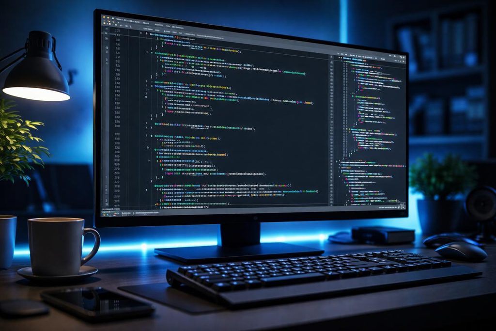
Programming and technical work
Dark themes are popular among programmers because syntax highlighting stands out against a dark background, and the interface can feel less glaring during long sessions. However, well-designed light code editors can be equally effective.
Photography, graphics, and video editing
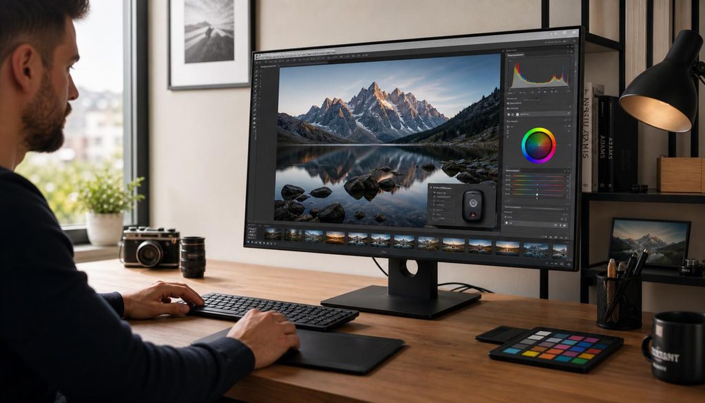
A neutral, subdued interface can help keep attention on the image or video rather than surrounding controls. However, accurate color work depends more on monitor calibration, color management, and viewing conditions than on the theme itself.
5. Contrast, brightness, and readability
Both themes can provide good readability, but their characteristics differ.
- Light mode typically presents dark characters against a bright background. It often provides strong readability for continuous text and resembles the contrast of ink on paper.
- Dark mode presents bright characters against a dark background. It can be comfortable when less overall screen light is desirable, but bright text may appear to bleed or bloom for some users.
- Extreme contrast can be uncomfortable in either direction. Pure white against pure black is not necessarily the most comfortable combination for everyone. Off-white backgrounds and dark gray text, or dark gray backgrounds and light gray text, can sometimes be easier on the eyes.
A theme’s implementation matters. Poorly chosen colors, thin fonts, inadequate spacing, and low contrast can make either theme difficult to use.
6. Personal preference and adaptation
There is also a psychological and habitual component. Someone who has used light interfaces for decades may find dark mode unnatural, while someone who spends most of the day in a dark code editor may prefer it everywhere.
Preferences can also change with circumstances:
- Daytime versus nighttime use.
- A bright office versus a dark bedroom.
- A large desktop monitor versus a small laptop screen.
- High brightness versus reduced brightness.
- Reading for hours versus checking information briefly.
Neither preference is inherently more modern, healthier, or technically sophisticated.
7. What about blue light and sleep?
Dark themes are sometimes promoted as a way to reduce blue-light exposure. They can reduce total emitted light when the screen content becomes darker, but dark mode is not the same as a blue-light filter.
The effects of evening screen use on sleep depend on factors such as brightness, light spectrum, duration, and timing. A dark theme may help reduce overall light exposure, but lowering brightness, using warmer color temperatures at night, and avoiding stimulating screen activity close to bedtime may also be useful.
Practical recommendations
| Situation | Reasonable starting point |
|---|---|
| Bright room or daylight | Light theme, with brightness matched to the room |
| Dim room or nighttime use | Dark theme or a dimmer, warm-toned light theme |
| Reading long articles or documents | Light theme, with comfortable font size and spacing |
| Programming for extended periods | Whichever theme provides the clearest syntax and least discomfort |
| OLED laptop or monitor | Dark theme if reducing power consumption is useful |
| Color-critical photo editing | Calibrated display and controlled ambient lighting, regardless of theme |
| Uncertain which is best | Use automatic theme switching based on time of day, if available |
Bottom line: The best theme is the one that provides comfortable, sustained readability under the user’s actual viewing conditions. Display technology and room lighting influence the result, but eyesight, task, screen brightness, and individual preference can be just as important. There is no convincing universal rule that everyone should use either light or dark mode.