Introduction
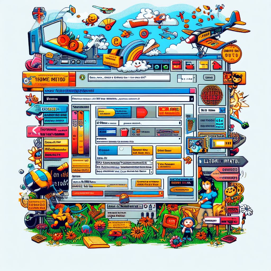
The early 2000s were a wild and colorful time in the world of computing. The digital landscape was filled with animated GIFs, scrolling text marquees, dancing hamsters, and MIDI files that played automatically. The interfaces of both webpages and operating systems, notably Microsoft Vista, were a hot mess of extravagant design choices that were considered novel at the time. However, as technology evolved and user expectations shifted, what was once seen as exciting and innovative eventually became annoying. This article will delve into the fascinating era of early 2000s computer GUIs and web design and how the trend evolved towards cleaner and simpler designs.
The dancing hamsters and the age of excess
The early 2000s were characterized by an exuberant approach to web design. Websites were often overloaded with flashy elements, including dancing hamsters, spinning globes, and under-construction GIFs. Users were bombarded with neon colors, oversized fonts, and excessive animations, all of which were thought to capture attention and make websites stand out. While these designs were indeed eye-catching, they quickly became synonymous with a cluttered and chaotic browsing experience.
MySpace: A canvas of confusion
One platform that exemplified the chaos of early 2000s web design was MySpace. MySpace allowed users extensive freedom to modify the design of their pages. While this was initially seen as a way for individuals to express themselves creatively, it often led to pages with paisley backgrounds, clashing colors, and illegible text. Users went overboard with their personalization, resulting in a confusing mishmash of elements that made it challenging to navigate and read content.
Facebook’s arrival: Embracing simplicity
Amid the MySpace mayhem, Facebook entered as a fresh competitor in 2004. In stark contrast to MySpace, Facebook imposed strict design guidelines and did not allow users to change the colors or layout of their pages. Mark Zuckerberg’s vision for the platform was to create a clean and consistent user experience. Facebook’s white and blue color scheme, along with a structured and unchanging layout, was a departure from the chaos of MySpace’s user-designed pages.
The Shift Towards Clean and Simple Designs
As technology advanced and user preferences evolved, the early 2000s design trends started to lose their appeal. Users grew tired of cluttered webpages and overly complex interfaces. They demanded cleaner, more intuitive designs that focused on usability and content. The minimalist design approach gained traction, emphasizing simplicity, clear navigation, and an uncluttered user experience.
Apple’s influence
Apple played a significant role in popularizing clean and simple design with the release of the iPhone in 2007. The iPhone’s user-friendly interface, characterized by its sleek and minimalist design, intuitive touch controls, and app icons, set a new standard for user experience. This influenced the design of not only mobile devices but also websites and computer interfaces.
The emergence of responsive web design
The rise of mobile devices and varying screen sizes necessitated a shift in web design. Responsive web design, which ensures that websites adapt to different screen sizes and resolutions, became a standard practice. This encouraged designers to prioritize simplicity and content organization to ensure a consistent user experience across devices.
Conclusion
The early 2000s were a time of exuberant experimentation in computer GUIs and web design, marked by dancing hamsters, HTML scrolling text marquees, moving GIFs, MIDI files, and shiny buttons. While these design choices were initially novel and exciting, they eventually became overwhelming and annoying for users. The shift towards clean and simple designs, influenced by technological advancements and evolving user preferences, marked the end of this era. Today, we appreciate the elegance and functionality of modern user interfaces that prioritize usability and simplicity, leaving behind the chaotic excesses of the early 2000s. The juxtaposition of MySpace’s design freedom and Facebook’s rigidity serves as a compelling example of this transition from cluttered complexity to clean simplicity.