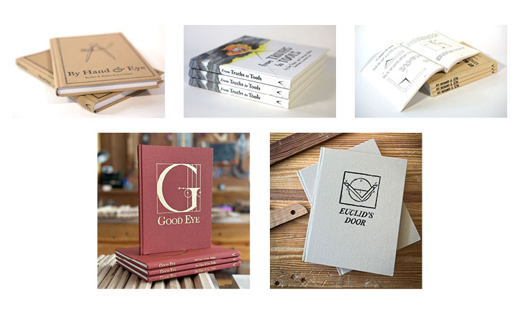
“Artisan Geometry” is the overarching term used to describe the design approach in the five Lost Art Press books by Jim Tolpin and George Walker. We often get asked to explain it, and to recommend one or more of their books with which to get started.
We decided those questions would be better answered by Jim and George themselves – so they wrote a brief explanation of the term, then gave us some summations of each of the books. Check out the new Artisan Geometry page in our online store for their thoughts.
fig. 2.2.22. The human form resides just beneath the surface.
Below is a short excerpt (a sidebar) from “By Hand & Eye,” the first artisan geometry book by George Walker and Jim Tolpin.
In “By Hand & Eye,” the authors show how much of the world is governed by simple proportions, noting how ratios such as 1:2; 3:5 and 4:5 were ubiquitous in the designs of pre-industrial artisans. And the tool that helps us explore this world, then as now, are dividers.
One key to good design is to master these basic “notes” – much like learning to sing “do, re, mi.” How to do this is the subject of the first three-quarters of the book. It offers exercises, examples and encouragement in opening your inner eye, propping it up with toothpicks and learning the simple geometry that will help you improve your design.
Critics point out that modern builders and architects can fall into a malady called the Greek Temple disease: slapping together classical elements from antiquity to somehow capture a sense of power and integrity. Of course, they do so without a clue about where these qualities came from, and how they came to be imbued in buildings from antiquity. It’s an easy conclusion to make if we focus on the surface without considering there might be something deeper. It’s true that many of our revered civic buildings often were modeled after temples from antiquity. Historical design literature emphasized the perfection found in the Greek and Roman classic orders.
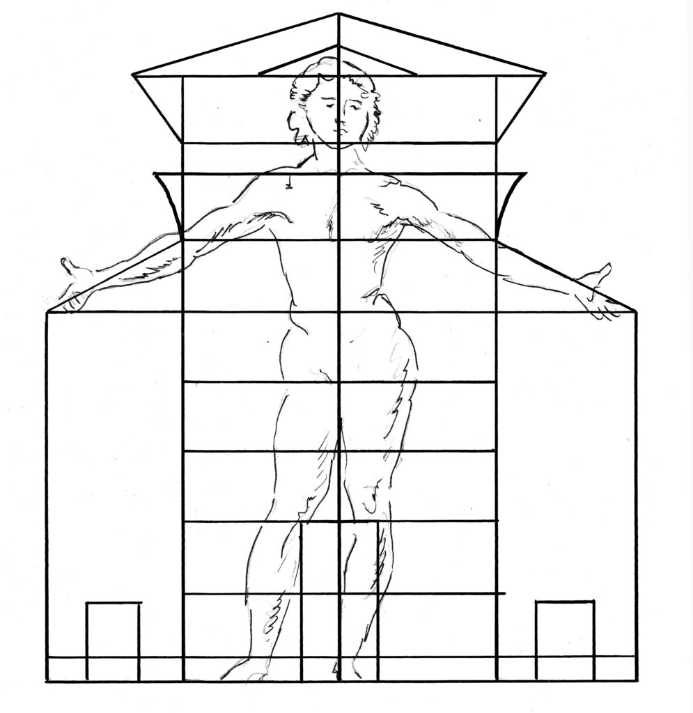
fig. 2.2.23. Because classic orders are anthropomorphized forms, it was even thought that an interior with multiple layers of objects based on the orders was filled with human forms.
Yet the tradition reveals something deeper than a fascination with carved stone columns. To the Greeks, the classic order was the embodiment of the human form, but also of the building itself. Sweep them away and the roof collapses. The Romans extended the idea that the orders embodied the human form, yet applied new materials: concrete and brick. The result was that walls could support a building without requiring the orders for structural integrity. Yet they still used the classic orders to organize the façade, even though columns often had little or no structural role. They began to shadow the orders using shallow representations, sinking pilasters and half-columns into a wall to suggest the order. Later, designers completely eliminated columns or pilasters but continued to weave the proportional sequences to organize a façade. An exterior or interior wall could be divided into beginning, middle and ending using mouldings and paneling to echo an invisible classic order. Not just walls, but just as the order has internal elements that repeat the beginning, middle and ending, other elements in an interior – windows, fireplaces, furniture, candle stands, lamps – all could shadow the classic orders. Because the orders embody the human form, designers were in essence filling their homes with a host of human figures large and small.
p.s. We’re working right now on a new artisan geometry book from George Walker and Jim Tolpin, “Good Eye, Skilled Hands,” that we hope will be out later this year. In it, they explore the practical applications of lessons found in historic furniture forms.
Punctuating a form creates a distinct beginning, middle and end.
The following is excerpted from “By Hand & Eye,” by George R, Walker and Jim Tolpin. The book is a deep dive into the world of history, architecture and design. And the authors have emerged with armloads of pearls for readers.
Instead of serving up a list of formulas with magical names (i.e. the Golden Section, the Rule of Thirds) that will transform the mundane into perfection, George R. Walker and Jim Tolpin show how much of the world is governed by simple proportions, noting how ratios such as 1:2; 3:5 and 4:5 were ubiquitous in the designs of pre-industrial artisans. And the tool that helps us explore this world, then as now, are dividers.
The key to good design is to master these basic “notes” – much like learning to sing “do, re, mi.” How to do this is the subject of the first three-quarters of the book. It offers exercises, examples and encouragement in opening your inner eye, propping it up with toothpicks and learning the simple geometry that will help you improve your design.
Punctuation is employed to create pauses and transitions to organize a design into something our eye can take in and comprehend. It’s used on the macro level to establish a beginning, middle and ending of the overall form, and can be woven into the smaller details within a form to visually string elements together.
This small inlay plays an important visual role. It tells the eye that one part is ending and something different is about to occur.
Punctuation can be used to organize a design by creating a distinct beginning, middle and end. This is one of the defining features of traditional design. So much so that it’s woven into the way we tell a story, sing a song or design a building. Our own bodies illustrate this tripartite arrangement with feet, torso and head. Because the human form lies at the very core of this traditional approach, designs are primarily organized vertically, with the beginning at the bottom and ending at the top. Without thinking, when we take in a design we note how it’s anchored to the floor and how it terminates at its highest point. In nature we find abundant examples of organic transitions. Trees don’t just jut up from the earth like a utility pole planted by the phone company. Though largely hidden from sight, the roots flow into the tree trunk just above the soil, bulging out in response to the mass above. Pre-industrial artisans wove this theme into their designs, sometimes boldly creating a beginning with a ball-and-claw foot. Or they took a subtle tack and established a beginning with a small bead, inlay or slight change of taper. Brash or subdued, they help the design tell a story.
Traditional moulding profiles often took their cue from nature.
Also note that most of our traditional moulding profiles have a correlation with the transitions or borders we encounter in nature. The series of torus mouldings swelling at the bottom of a column shadow the swelling of a tree trunk at the roots. The gentle arch of a cove moulding mimics the transitions found in tree branches as they spread to form the canopy.
Two simple punctuations at top and bottom create the major parts of this order. The bottom (beginning) portion is called the pedestal, which supports the column (middle), which in turn ends with the entablature.
The classic orders are a textbook of this beginning, middle and ending, with punctuation woven into the form from the major parts down to minor details. From a proportional standpoint they offer several practical examples of how to achieve punctuation, a reminder that it’s about the principle and not about any specific proportions. Probably one of the most profound lessons they offer is the way they help us see the internal relationship between the larger element and smaller. Punctuation is achieved by dividing up a space into five or more equal parts and having the part at one end act as the beginning or ending. The physical act of stepping off the space with dividers helps us see more clearly the proportional dynamic. When I first began making design judgments, I often had a hunch something wasn’t working. I might sense the feet on a chest were too large. But it wasn’t obvious to my eye that I was uncomfortable with the relationship between the height of the feet and height of the case above it. Walking through the different examples of punctuation in the classic orders drove the lesson home. Now, without thinking, I size up border elements with the spaces they punctuate. Often a border might be too narrow and look weak or, conversely, be too wide and look clumsy because the border element competes rather than complements. As you make the connection between the space and its punctuating border, it becomes easier to see how parts relate.
Does your eye sense anything amiss with the relation between the top and the structure below? Knowing the top punctuates the space below it helps to visualize where this feeling arises.
The classic orders are filled with examples of punctuation woven into the overall form as well as the smaller details. The overall form on all the orders are organized vertically by dividing the entire height into five equal parts and making the bottom part the beginning. The bottom part, or pedestal, punctuates the space above it. On a Doric order, divide the remaining height above the pedestal by five again to establish the ending at the top. This top space is called the entablature and punctuates the space below it. The Ionic and Corinthian orders use a slightly different punctuation sequence, dividing the upper portion by six parts to create a more slender feel.
(L) This idea of punctuation repeats itself. Note that the proportions vary (they are not all one-fifth) but still convey the idea of beginning, middle and end, echoing throughout the entire order. (R) A moulding or inlay detail can incorporate punctuation, in effect weaving this idea of beginning, middle and end down to smallest details.
There’s ample evidence from historic design books that artisans became familiar with a small handful of proportional sequences and the visual effect they lent to a composition. I like to think of them as an array of spices. It’s more important to begin by getting a sense for the flavor they impart, rather than for the actual proportions themselves. You can begin to gain a working vocabulary of these proportional relationships by drawing Doric classic orders in the exercise in Section II, Chapter 4.